How to Track Sales Data Using Line Charts in Reports

Introduction
Due to the large amount of data sales teams collect and deal with every day, like leads, deals, targets, and customer activity, making sense of it all is usually overwhelming. When reports are just rows of numbers, many managers or sales representatives find it difficult to spot trends or explain results clearly in meetings. That’s why having the right visuals is so important. In this blog, we’ll look at the challenges in sales visualization, how line charts in reports help turn messy data into clear insights, and how sales teams use Bold Reports line charts to track progress and find new opportunities. Let’s get started.
Challenges in sales data visualization
Despite having access to vast amounts of sales data, many organizations struggle to extract meaningful insights. Here are some of the most common reasons why:
Disorganized or overwhelming data: Sales data is often scattered across multiple spreadsheets and systems, making it difficult to consolidate and analyze. Without a centralized view, insights remain buried.
Difficulty identifying patterns: Raw numbers alone rarely tell a clear story. Without visuals, trends and anomalies go unnoticed.
Siloed insights between teams: When sales and marketing operate in silos, important insights don’t get shared, leading to missed opportunities and inefficiencies.
Inflexible reporting tools: Outdated tools make it hard to customize views, compare performance, or dig deeper into data segments.
Inconsistent KPIs across departments: When teams track different metrics without alignment, confusion arises around performance and priorities.
Next, let’s explore what a line chart is and how it helps solve sales visualization challenges.
Understanding line charts in reports
A line chart is a kind of chart that employs lines to link data points. It’s a simple and effective way to visualize how continuous data changes over time. It is often used to track stock price performance, study weather trends, or monitor population growth.
Line Chart
How line charts improve sales reporting
Using line charts in your sales reports helps resolve common challenges in the following ways:
Makes data digestible: By turning large datasets into simple lines, line charts help users quickly understand performance over time.
Breaks down silos: Reports using line charts can integrate data from sales, marketing, and support, helping all teams make aligned, informed decisions.
Offers flexibility: With features like filtering, drill-down, and custom data fields, line charts allow users to tailor insights to their specific needs.
Now that we’ve seen how line charts can tackle common challenges, let’s explore best practices to maximize their effectiveness in the sales domain.
4 best practices for using line charts in sales reports
When using line charts to break down sales data into meaningful insights, keeping the following factors in mind ensures your analysis is clear, accurate, and actionable:
Choose the right time interval: Select an appropriate measurement interval (e.g., daily, weekly, monthly) that balances detail and clarity. Too broad hides trends; too narrow shows noise rather than meaningful patterns.
Clear axis labels: Label the x-axis (usually time) and y-axis (sales metrics) clearly so viewers understand what the chart represents. Avoid dual axes to prevent confusion.
Limit number of lines: Avoid overcrowding the chart with too many lines. Focus on key products or regions to keep the chart readable and insights clear.
Ensure data quality: Use accurate, up-to-date data to avoid misleading conclusions. Clean data is essential for reliable insights.
By following these best practices, you can visualize line charts with Bold Reports to clearly track sales performance, highlight trends, and uncover growth opportunities, all in an intuitive, interactive dashboard.
5 use cases of line charts in sales reports
Line charts in reports provide a clear visual representation of sales trends, performance metrics, and team activities over time. The following are real-time scenarios of how a line chart created in Bold Reports can be used to reveal trends, insights, and opportunities in sales data.
Opportunity distribution by owner
Line charts can be used to visualize how different opportunity states—Open, Won, and Lost—are distributed across individual salespeople. This helps teams identify who consistently closes deals, who may need support, and how opportunity flow varies across the team.
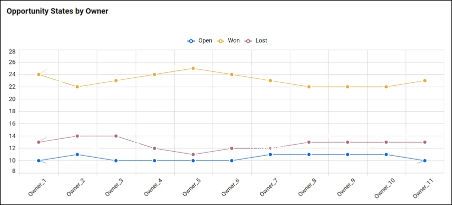
Opportunity Analysis Line Chart
Performance comparison
Line charts can also be used to compare different sales outcomes, such as won versus lost revenue, over time. This helps teams evaluate the effectiveness of their strategies and identify areas for improvement.
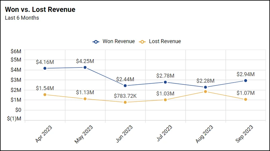
Performance Comparison Line Chart
Daily opportunity tracking
Line charts are ideal for monitoring daily activity, such as the number of new sales opportunities created. This helps sales teams stay agile by identifying spikes or drops in engagement and adjusting outreach strategies accordingly.

Daily Opportunity Line Chart
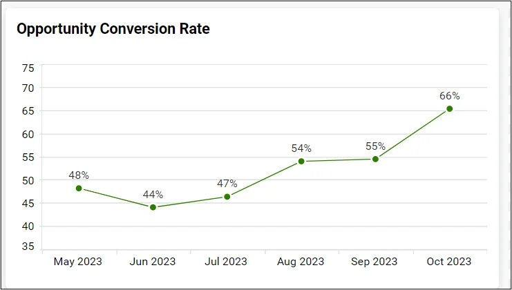
Conversion rate monitoring
Line charts are effective for tracking conversion rates over time, helping sales teams understand how efficiently opportunities are being turned into closed deals. This insight supports strategic adjustments to improve performance.
Conversion Rate Line Chart
Win rate forecasting
Line charts can be used to track win rate trends and project future performance. By including forecasted values along with upper and lower bounds, teams gain a clearer picture of expected outcomes and the range of possible variation, supporting more confident planning and decision-making.
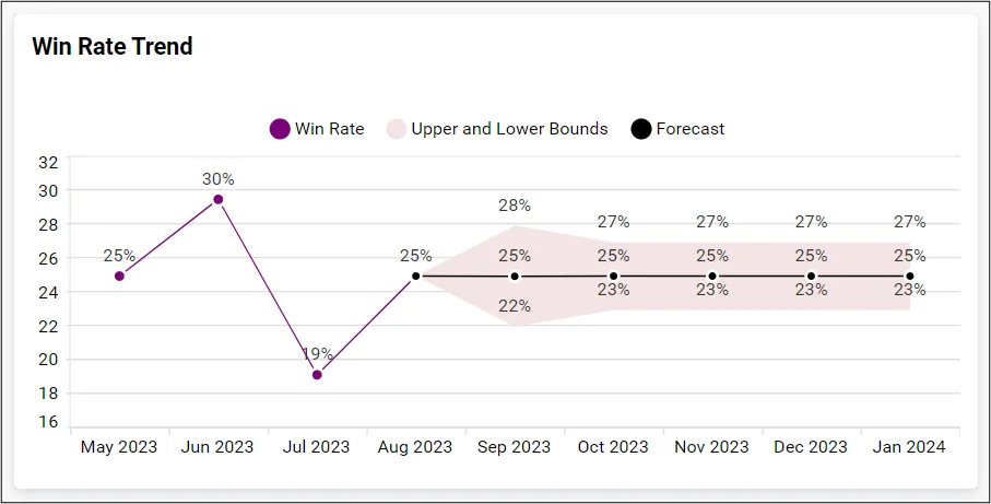
Win Rate Forecasting
With these use cases, you can clearly visualize sales performance, track team activities, and forecast future outcomes using line charts. You can use Bold Reports to create line charts like the ones shown in this blog to bring these insights to life. Check the documentation to learn how to configure line charts, build a report, and share it with your team effortlessly.
Conclusion
Line charts in reports are a smart way to turn messy sales data into clear, useful insights. They help you track progress, spot trends, and make better decisions without getting lost in numbers. With line charts in Bold Reports, presenting sales data becomes easier and more impactful.
Ready to see the difference? Start your 30-day free trial with Bold Reports® today and transform your sales data into powerful visual insights. During your trial, explore prebuilt line chart templates or design your own to make smarter, faster decisions.


