Dashboard vs Report: Which Do You Need for Your Business?

Introduction
In today’s competitive landscape, organizations rely on data to grow, adapt, and stay ahead. Dashboards and reports are two of the most widely used tools for transforming raw data into meaningful insights. Though they often work together, each serves a distinct purpose and offers unique advantages. This article explores the differences between dashboards and reports, outlines when to use each, and helps you choose the right tool to support your business goals.
What is a dashboard?
A dashboard is a dynamic way of presenting various types of visual data in one location. It combines key performance indicators (KPIs) and data metrics, giving a snapshot of operations and progress toward goals in real time. Dashboards facilitate teams to track performance effortlessly and make quick, confident decisions.
When should you use a dashboard?
Use a dashboard when:
You need to have a quick overview of key metrics or KPIs in one place.
You want to view trends for your KPIs over time, for example, by day or by week.
You want to share insights with your managers or executives clearly and interactively.
You want to explore data interactively.
An example of a dashboard
The following retail inventory management dashboard gives an end-to-end view of inventory, future inventory, sell through rate, days inventory outstanding, and order fill rate in real time. Managers can make effective decisions to decrease stockouts, minimize excess inventory, and optimize overall operational effectiveness by using dashboards.
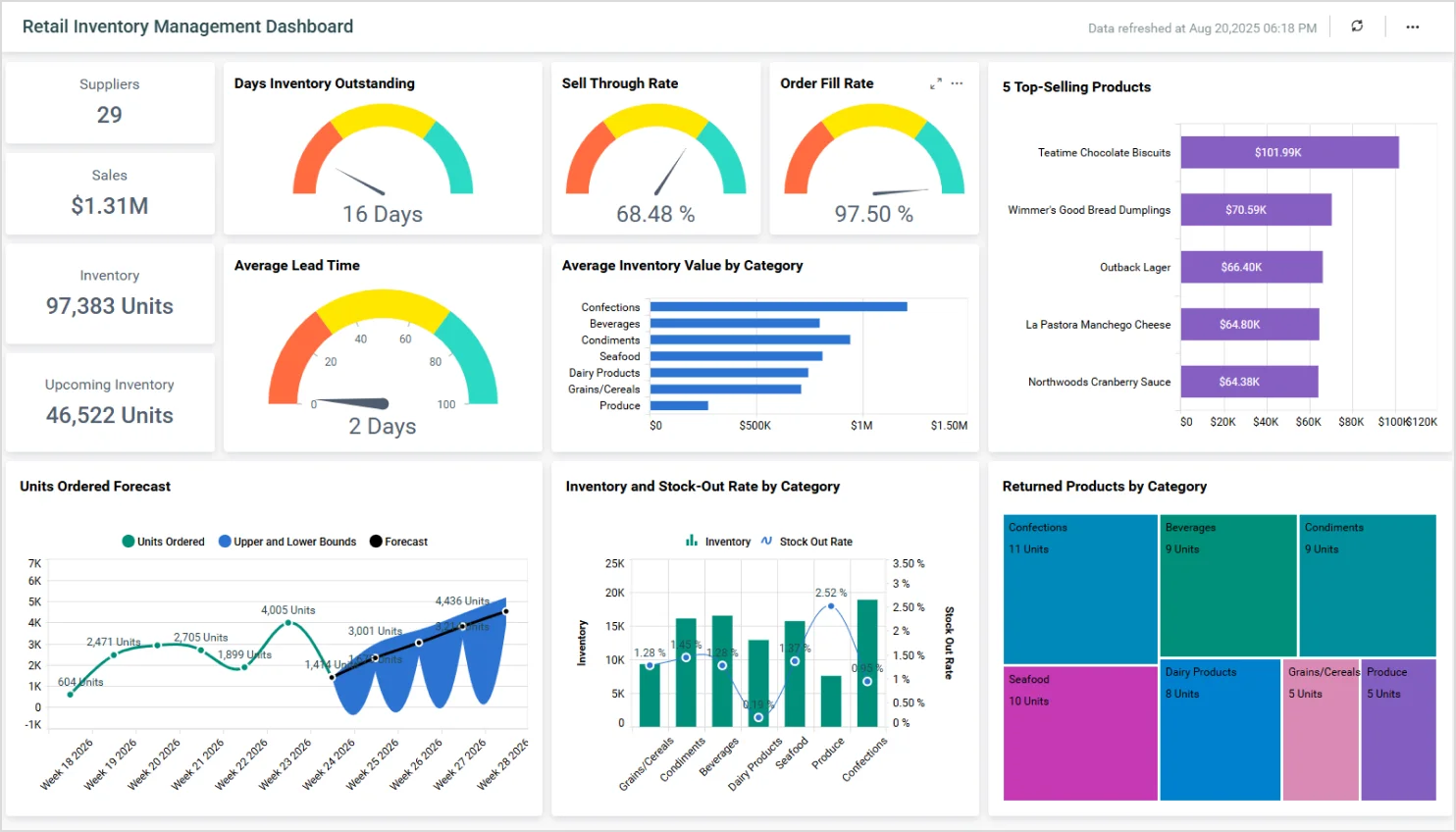
An example of a dashboard
To explore more dashboards and see how you can optimize operations and reduce cost in your organization, check our live demo.
How can a dashboard benefit you?
A dashboard can benefit you in many ways, depending on your role and the type of data you’re working with. Here are some key advantages:

Real-time data: Dashboards provide up-to-date information at a glance, helping you monitor performance, spot trends, and respond quickly to changes.
Interactivity: Users can filter, drill down, and explore data in depth, gaining tailored insights that are most relevant to their needs.
Time saving: Instead of manually compiling reports, dashboards automatically pull and display data, saving time and effort.
Quick decision-making: By visualizing key metrics and KPIs, dashboards support data-driven decisions, reducing guesswork and increasing accuracy.
Now that we’ve learned about dashboards, let’s explore what reports are to see how they complement dashboards in providing detailed, structured insights for deeper analysis and decision-making.
What is a report?
A report is a structured document that presents data, analysis, and insights in a clear format. It’s often used to track progress, summarize findings, or support decisions, and is usually more in-depth and static than a dashboard.
When should you use a report?
Use reports when:
You are required to present detailed information with context, analysis, and explanations.
You want to capture findings for future reference or compliance purposes.
You are required to share structured insights with stakeholders in a formal format.
You are required to document static data from specific time periods (either monthly or quarterly).
An example of a report
A sales order report shows product data, totals, and includes certification for accuracy. These reports make auditing easier, facilitate compliance, and enable open communication. They help firms monitor sales activity, track order completion, and make wise decisions regarding inventory and customer service.
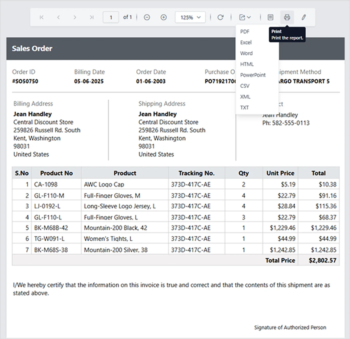
An example of a report
To see many examples of reports and how they can lead to more informed decisions across your business, explore our live demo and experience the power of real-time, actionable insights for yourself.
How can a report benefit you?
Reports excel in understanding and communicating complex data over time due to their structured, in-depth format. Below are the advantages:
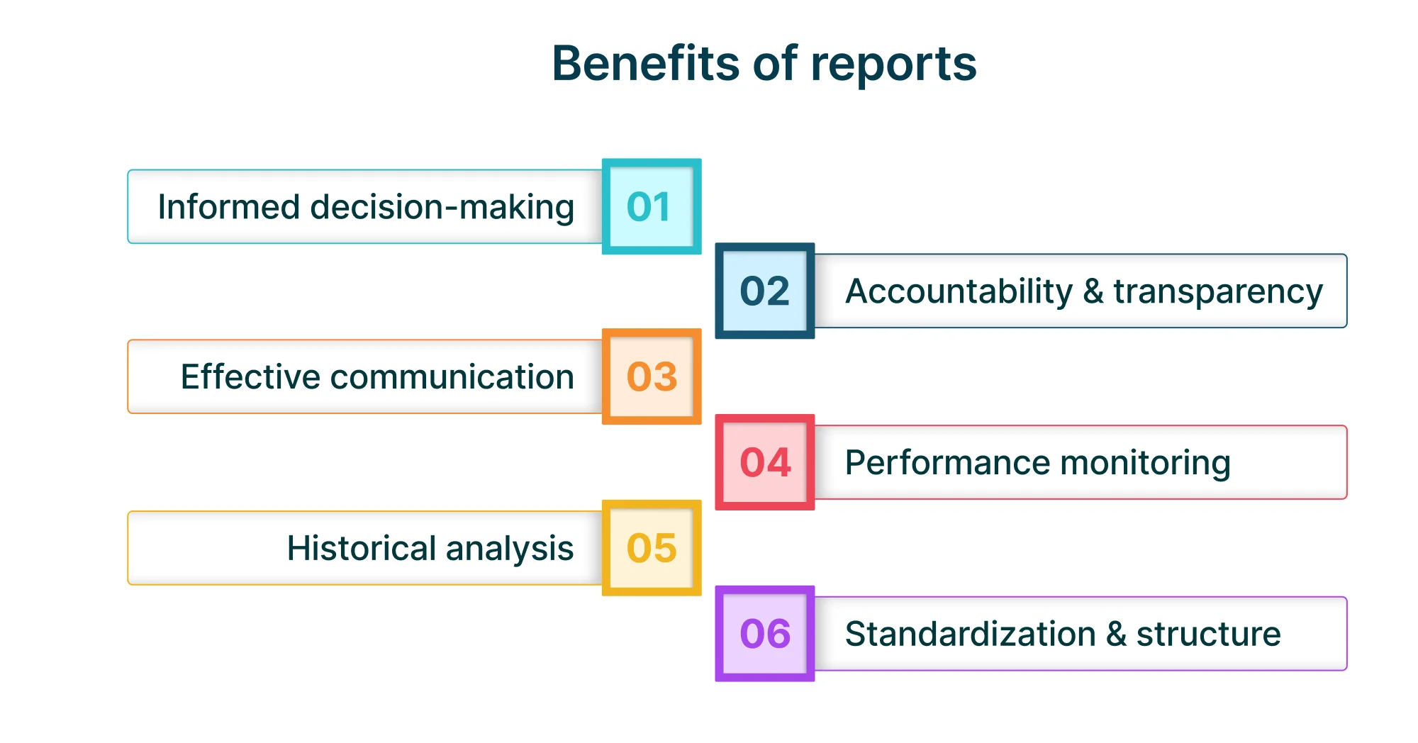
Informed decision-making: Reports provide timely, relevant, and structured data that help stakeholders make strategic, evidence-based decisions.
Accountability and transparency: By documenting activities, outcomes, and progress, reports promote accountability and ensure that responsibilities are tracked and met.
Effective collaboration: Reports align teams around shared data, supporting joint planning, execution, and problem-solving.
Performance monitoring: They allow organizations to track KPIs, measure progress toward goals, and identify areas for improvement over time.
Historical analysis: Reports have historical data, enabling trends to be analyzed and helping firms achieve long-term patterns and outcomes.
Standardization and structure: Reports have a standardized form so that it is simpler to compare information between time frames, departments, or projects.
Now that we’ve discovered what dashboards and reports are and how they can benefit users, let’s explore their feature differences to help you determine which one best suit your business needs.
Dashboard vs. report: what’s the difference?
Choosing between a dashboard and a report depends on your business goals and how you intend to use your data. Recognizing their unique strengths helps you select the most effective tool for your specific needs. Let’s explore their feature differences in detail.
| Feature | Dashboard | Report |
| Purpose | Allows real-time monitoring and fast decisions via a high-level view of key metrics. | Provides detailed analysis and documentation of data, trends, and insights. |
| Data visualization | Uses interactive charts, graphs, and gauges on a single screen for instant insights. | Combines narrative text with tables, charts, and visuals, often across multiple pages. |
| Depth of data | Focuses on a few critical KPIs for quick insights. | Offers comprehensive, data-rich content with analysis and context. |
| Use cases | Provides daily performance monitoring, easy tracking of KPIs, allowing users to spot trends and anomalies. | Allows monthly and quarterly reviews, compliance checks, audits, and strategic analysis. |
| Interactivity | Displays data in a highly interactive way with filters and drill-downs. | Displays data in a mostly static way with limited interactivity. |
Dashboard vs. report: which one do you need?
Both dashboards and reports play vital roles in transforming data into actionable insights—dashboards excel in real-time monitoring, while reports provide in-depth analysis and documentation. By understanding their unique strengths, you can confidently choose the right tool to drive smarter decisions and achieve your business goals.
With Bold products by Syncfusion®, you don’t just view reports and dashboards, you build them. Our intuitive platforms empower you to create, customize, and share professional-grade reports and dashboards on your own, without needing a developer. Explore Bold BI® and Bold Reports® live demos see how easy it is to bring your data to life and make informed decisions with confidence.
Sign up for a 30-day free trial to start building your first report today with Bold Reports—no credit card required.


