In business strategy, creating reports holds huge importance. Reports possess the ability to transform complex data into clear visuals, thus enabling companies to understand metrics and make informed decisions. It enhances planning, increases efficiency, and promotes the overall growth of a business.
However, these benefits only come with well-designed reports. A poorly thought-out report can cause confusion at best and mistakes at worst. In this blog, I will discuss the things that you should and shouldn’t do in designing reports.
Use proper language
Using proper language in your reports is important; it makes them clear, accurate, and professional. This helps get your message across effectively and reduces the chances of misunderstanding.
Know your audience
Knowing your audience in report design is crucial because it allows you to customize your content to their needs, level of understanding, and interests. It will help you structure your report and the amount of detail to include. This makes sure your report is interesting, covers everything, and gets your message across effectively.
Make it simple
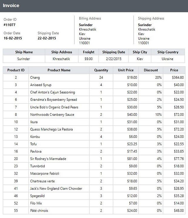
If the report design is too complicated, people might get confused. It’s best to use a moderate number of words and not include too much excessive content. This helps people read it quickly and get the important information. Simple reports are less likely to cause confusion or mix-ups.
Use visualizations
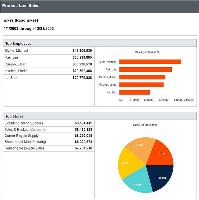
Visualizations make complex data more understandable and usable. They reveal trends and patterns that may be missed in text-based data, enabling better decision-making. Visuals are far more effective than raw data in grids in communicating information quickly.
Use consistent formatting
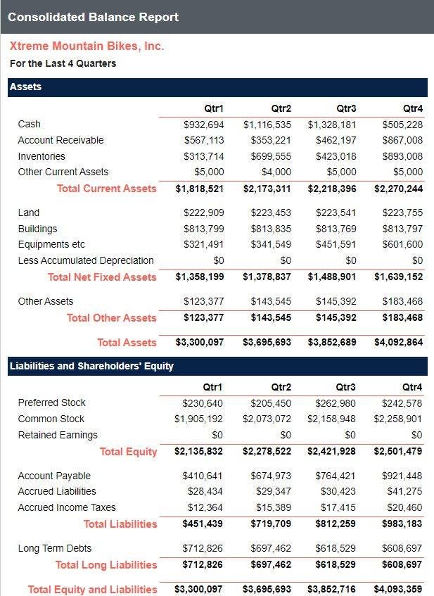
Consistent formatting is important in report design because it makes the report look organized and easy to understand. When all the headings, fonts, colors, and spacing are the same throughout the report, it helps readers know what to expect and where to find information. This uniformity makes the report more professional and engaging to read.
Don’t add too much content to your report
When there’s too much information in a report, it can be difficult for the reader to find the main point. This can lead to confusion and getting the wrong idea. But if the report is short and clear with balanced text and visuals, it shares information better. This helps the reader understand and stay interested.

Don’t add too much content to your report
Don’t use too many colors
Using too many colors in a report design can be distracting and confusing for the reader. It can make the report look unprofessional and cluttered. It’s best to stick to a simple color scheme that enhances readability and comprehension

Don’t use too many colors
Don’t ignore white space
White space is crucial in design, as it facilitates easy reading and comprehension. It involves making use of colors, fonts, and spacing to distinguish vital information in the content, guiding the reader through the report. Not using proper white space can result in a cluttered and unpolished appearance in reports. By utilizing white space effectively, a clean, well-organized, and impactful design can be achieved.

Don’t ignore white space
Use high-quality images
Using poor-quality images in report design can negatively impact the overall presentation and professionalism of the report. They can make the report look unprofessional and unattractive, which can lead to a lack of interest or engagement from the audience. Use relevant images with good resolution.
Don’t forget to review
Ensure the accuracy your report by double-checking that all the information presented matches the data you intended to display. If the numbers look off, double-check that your data is properly connected. Make sure to take time to review the report’s contents and appearance. This will ensure accuracy, clarity, and quality. A well-revised report conveys information effectively and maintains professionalism.
I hope this information serves as a solid foundation for your understanding of optimal report design practices. If you’re looking for cutting-edge reporting tools, consider our Bold Reports. Check out our top 10 reasons for choosing Bold Reports. I encourage you to explore and see why it could be the perfect fit for your business needs.
